Web Design Mistakes to Avoid in 2026
Have you ever gotten lost on a website?
We’ve all been there. A page that takes forever to load, buttons you can’t find, or text that’s too small to read is frustrating, and it makes you want to leave as fast as you arrived.
In this article, we cover the most common web design mistakes that hurt the user experience, and how to avoid them so your website is easy and enjoyable to use.
Usability Issues
Poor Navigation
Make your website easy to navigate with clear menus and a logical structure. Confusing navigation frustrates users and makes them leave.
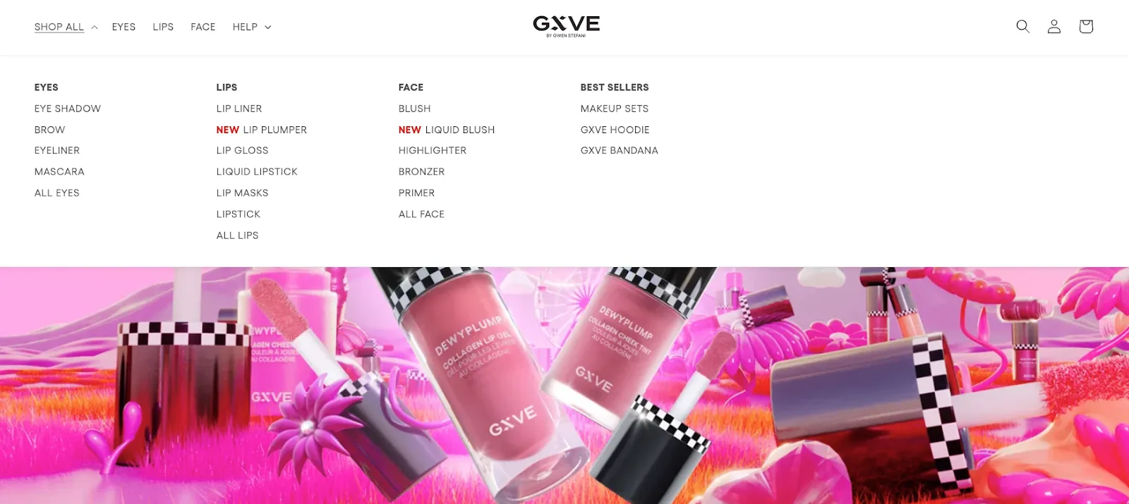
Good navigation looks like this: a clean, minimalist layout with a readable font, and menus that expand to reveal categories so visitors can explore with a single click.
Unresponsive Design
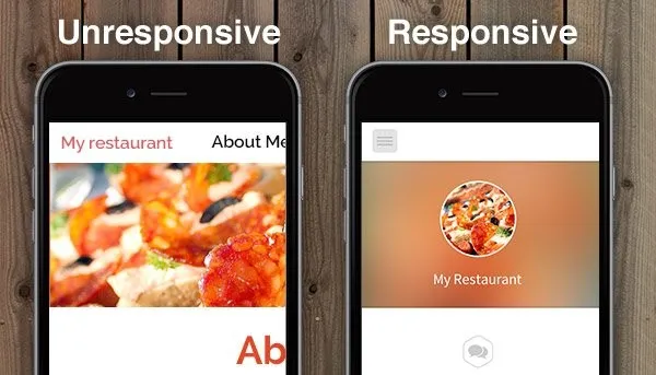
Most visitors browse on mobile devices. If your website doesn’t adapt to different screen sizes, you alienate a large part of your audience. Design mobile-first and test on real phones and tablets.
Slow Loading Times
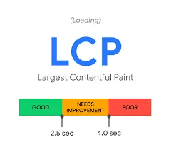
People are impatient. If your site takes too long to load, they will go to a competitor. Speed also affects your search rankings through Google’s Core Web Vitals, so compress images, use modern image formats, and avoid unnecessary scripts.
If your site runs on WordPress, a caching plugin is a good first step:
- WP Fastest Cache: A user-friendly plugin with several caching options.
- WP Super Cache: A popular choice that serves static HTML versions of your pages.
- W3 Total Cache: A more advanced option with CDN support and minification.
Accessibility
Not everyone has perfect vision, hearing, or motor control. Make your website accessible by adding alt text to images, providing transcripts for videos, ensuring good color contrast, supporting keyboard navigation, and using clear language.
Tips to get accessibility right:
- WCAG guidelines: Follow the Web Content Accessibility Guidelines. WCAG 2.2 is the current recommendation.
- User testing: Include people with disabilities in your testing to get valuable feedback.
- Accessibility statement: Publish a statement outlining your commitment to inclusivity and how users can send feedback.
Content and Visuals
Too Much Clutter
A cluttered website is overwhelming and unappealing. Use white space and avoid cramming too many elements onto one page. Common signs of clutter include:
- Flashing banners, pop-ups, and autoplaying videos that distract from the main content.
- A jumbled layout with text, images, and buttons crammed together.
- Unclear or poorly organized navigation that makes things hard to find.
- Low-quality or irrelevant content that adds no value.
Poor Use of Color
Color shapes the mood and usability of your site. Choose colors that complement each other, keep text readable, and avoid too many bright or clashing shades. Keep color theory in mind: each color carries associations, and they differ across cultures.
Unclear Calls to Action
What do you want visitors to do? Make your calls to action (CTAs) clear, concise, and easy to find. Recommended reading: How to design an effective CTA.
Low-Quality Images and Weak Hierarchy
- Low-quality images and videos: Grainy, pixelated, or blurry visuals reflect poorly on your brand. Use sharp, relevant visuals.
- Lack of hierarchy: Put the most important information first. Use headings, subheadings, and bullet points so the page is easy to scan.
Not Prioritizing User Experience
Design with the user in mind, aiming for a positive and intuitive experience. Two first steps for user-centered design:
- Develop user personas: Create profiles of your core user groups to understand their needs, goals, and pain points.
- Gather user feedback: Use surveys, interviews, and usability testing to see how real people use your site.
Unclear Communication
Make your message clear and easy to understand. Avoid jargon and technical terms your audience may not know.
Not Having a Clear Target Audience
Who are you trying to reach? Once you know, you can tailor your design and content to their needs.
Not Investing in Professional Design
If you don’t have design experience, consider hiring a professional web designer. A well-designed website can make a big difference to your brand image and your bottom line.
Key Takeaways
| Do | Don’t |
|---|---|
| Prioritize user experience: design with the user in mind, with intuitive navigation, accessible content, and smooth interactions. | Ignore responsive design: a site that doesn’t adapt to every device alienates users. |
| Keep it simple: opt for a clean design and focus on what’s essential. | Overcrowd pages: too much information overwhelms and confuses users. |
| Use high-quality imagery: sharp images and graphics improve visual appeal. | Use poor-quality images: blurry, pixelated, or stretched images look unprofessional. |
| Stay consistent: use the same branding, typography, colors, and layouts across all pages. | Overlook accessibility: make your site usable for people with disabilities. |
| Optimize loading speed: compress images, minimize requests, and write efficient code. | Neglect SEO: poor optimization means poor visibility in search results. |
| Include clear CTAs: guide users with clear, prominent next steps. | Use ambiguous CTAs: vague CTAs confuse users and hurt conversions. |
| Test across devices: check that your site works well on different devices and screen sizes. | Forget browser compatibility: test your site in different browsers. |
Conclusion
A well-designed website is an investment in your online success. By avoiding these common mistakes and focusing on user experience, you can build a site that informs, engages, and helps you reach your goals.
Don’t let your website be a maze. Contact OneK, your trusted partner for website design in Tangier, Morocco.